Design Challenge - Mobile App
How can we help patients with accessibility needs or time and attention pressures reduce their check-in time and paperwork at the Dr’s office?
Overview
Roles included:
Product Manager
UX Designer
User Researcher
Usability Tester
Responsibilities included:
Product ideation and business requirements
Product and project management
Primary and secondary research
Interviewing users, stakeholders, and specialists
Creating personas, workflows and user stories
Creating sketches, wireframes, and prototypes
Developing the design system
Performing usability testing
Research
Personas
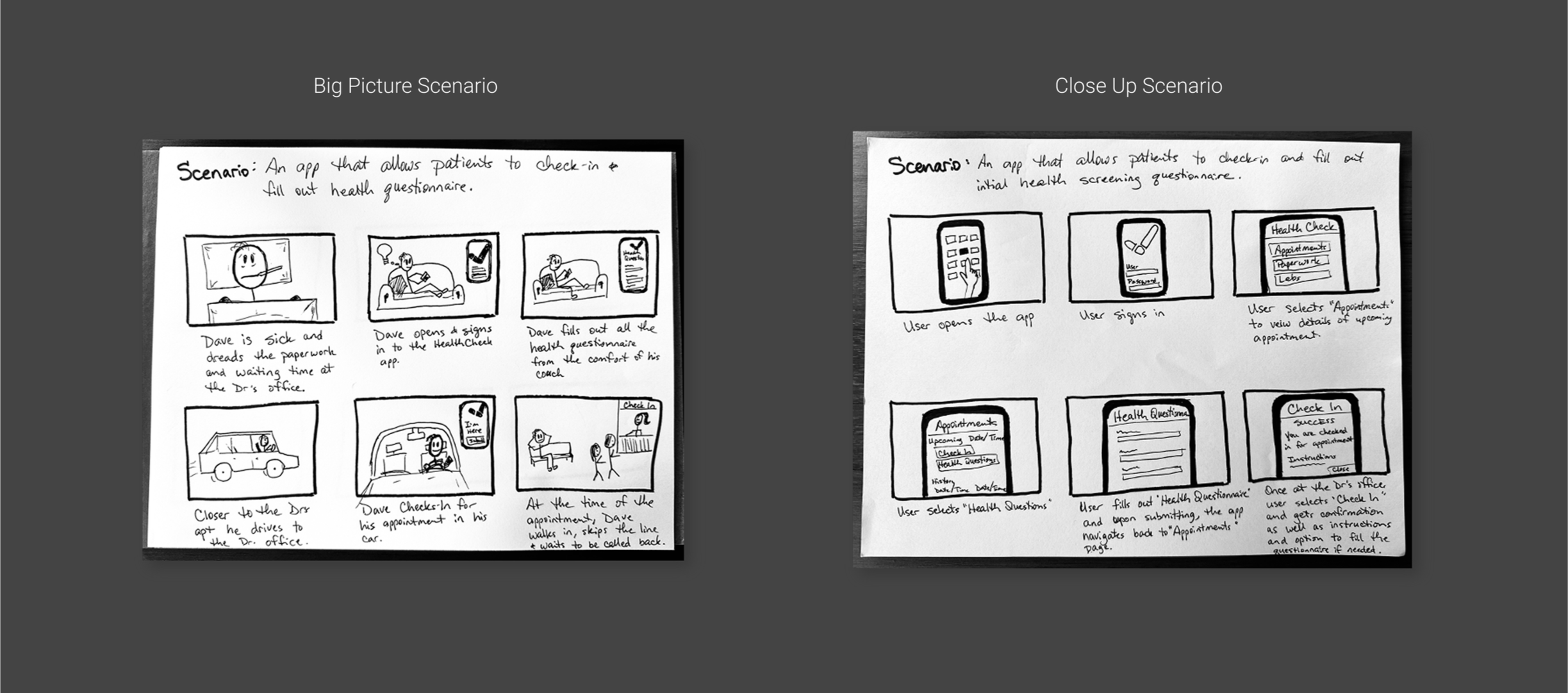
User Scenario
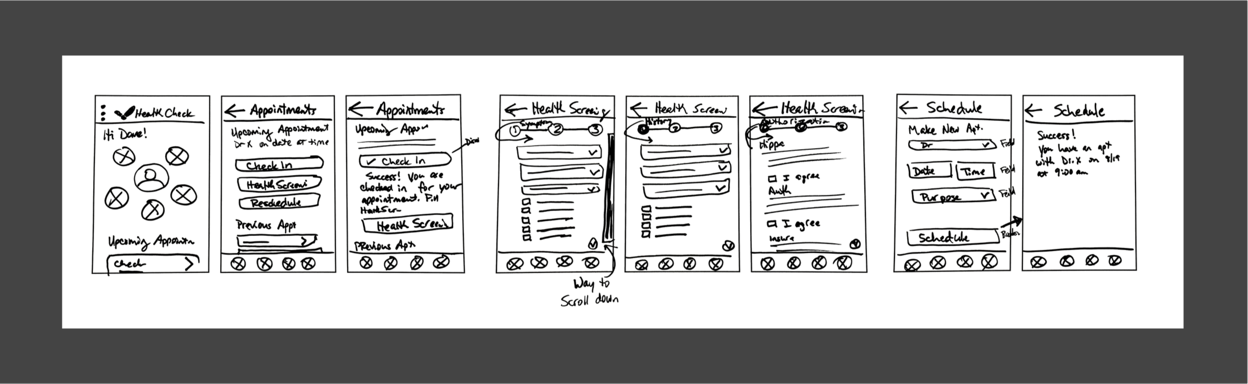
Paper wireframe
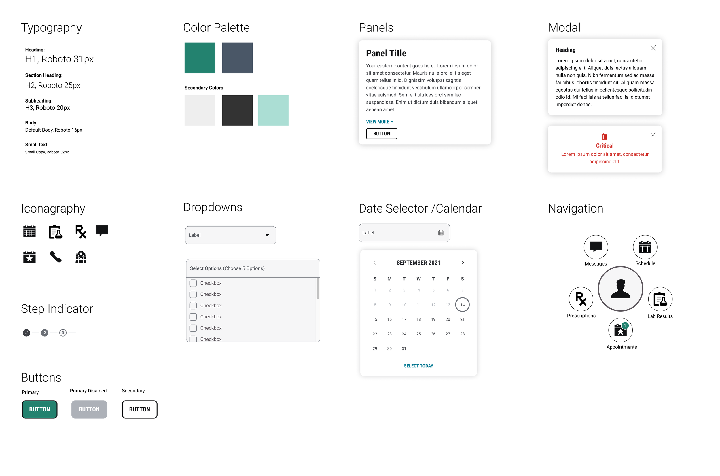
Branding Sticker Sheet & Design System
Design
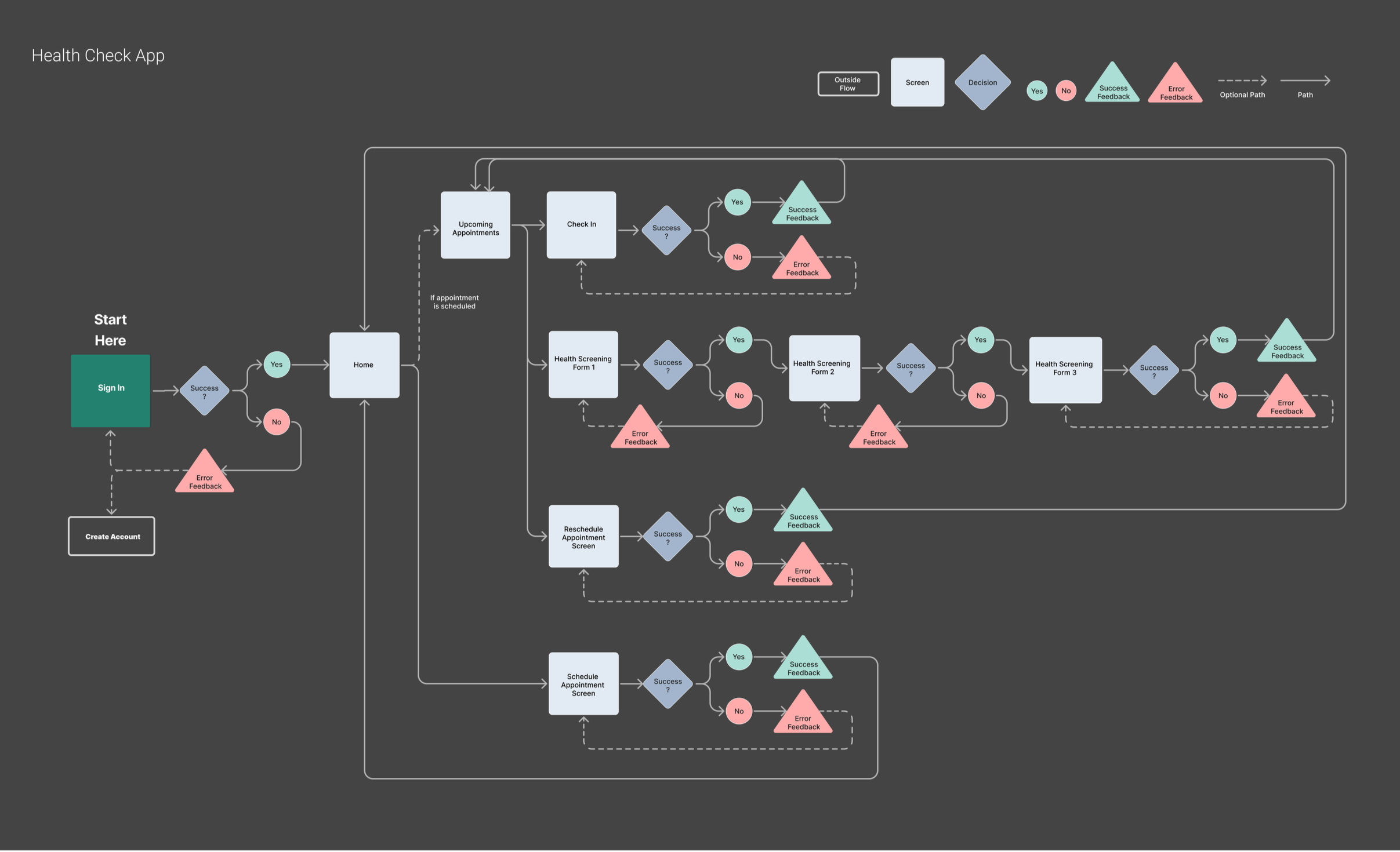
User Flow
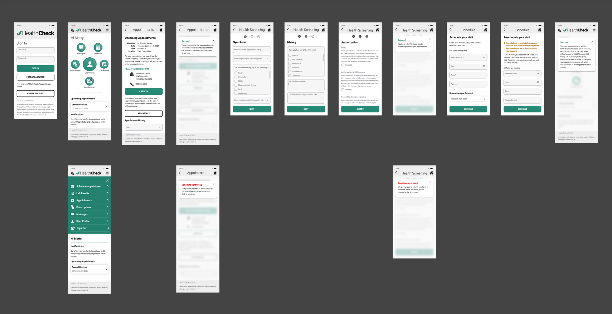
Wireframes
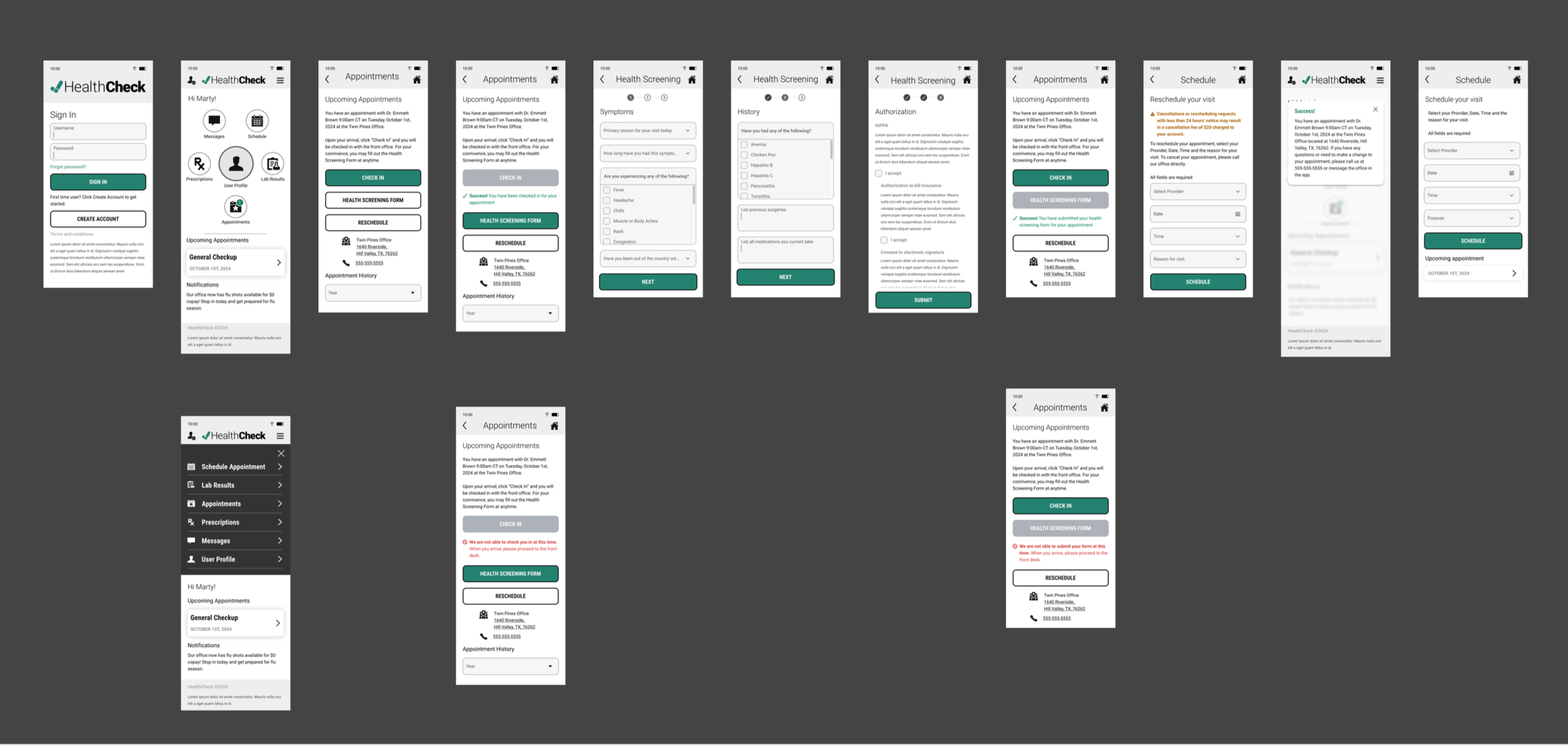
Following user testing, several updates were made to the screens. On Screen 0, the Create Account button was changed to a secondary white style to emphasize the Sign In CTA.
Screen 1 added icon titles for clarity, introduced a light separator bar between navigation and content, moved Notifications to the bottom, and added a dedicated button for managing appointments (upcoming, past, and future).
Screen 2, the footer was removed, buttons were reordered with explanatory text to avoid implying check-in is required, and cancel appointment functionality was added with fee details.
Screens 3 now use scrollable full-page forms instead of modals for better user control, with Next buttons disabled until forms are complete.
Screen 4 redirects users to home after scheduling/rescheduling, using a modal to ensure the success notification is seen.
Screen 4.1 displays upcoming visits on the Schedule screen, allowing users to view details or make changes.
These changes improve clarity, reduce distractions, and enhance overall user control.
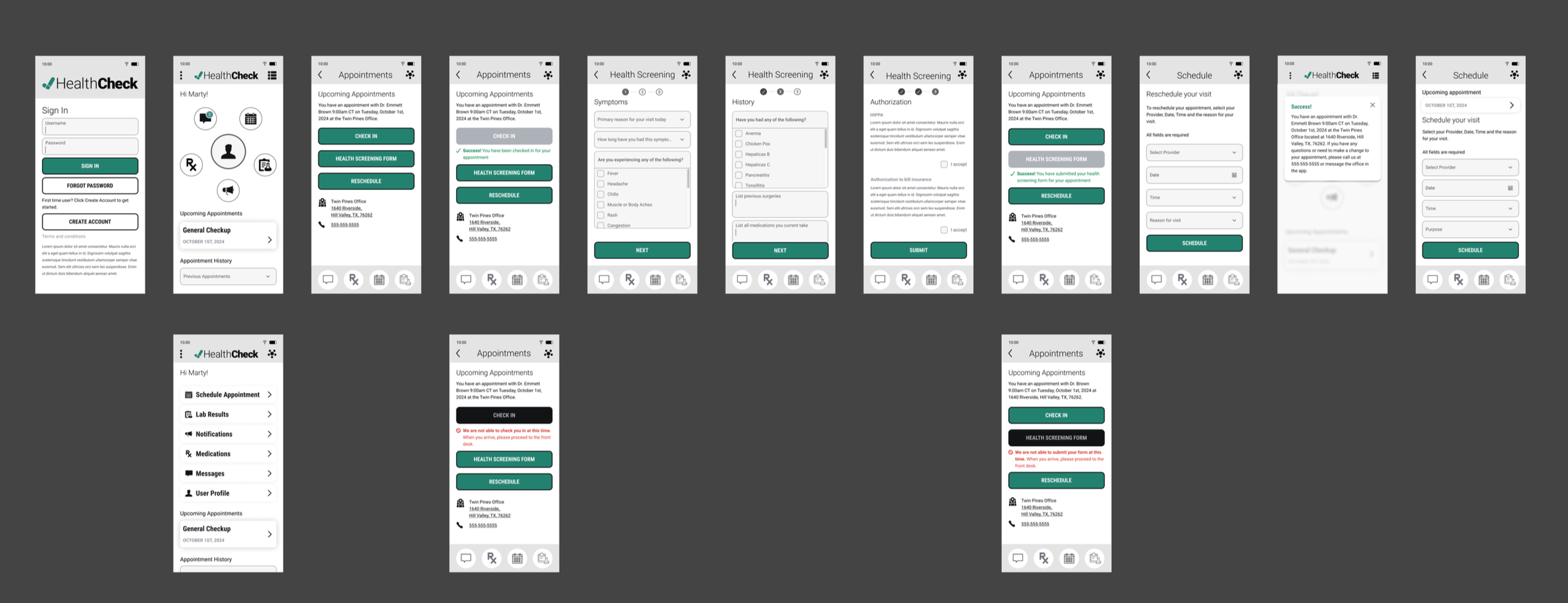
Prototype